- General
-
 Ideas
Ideas

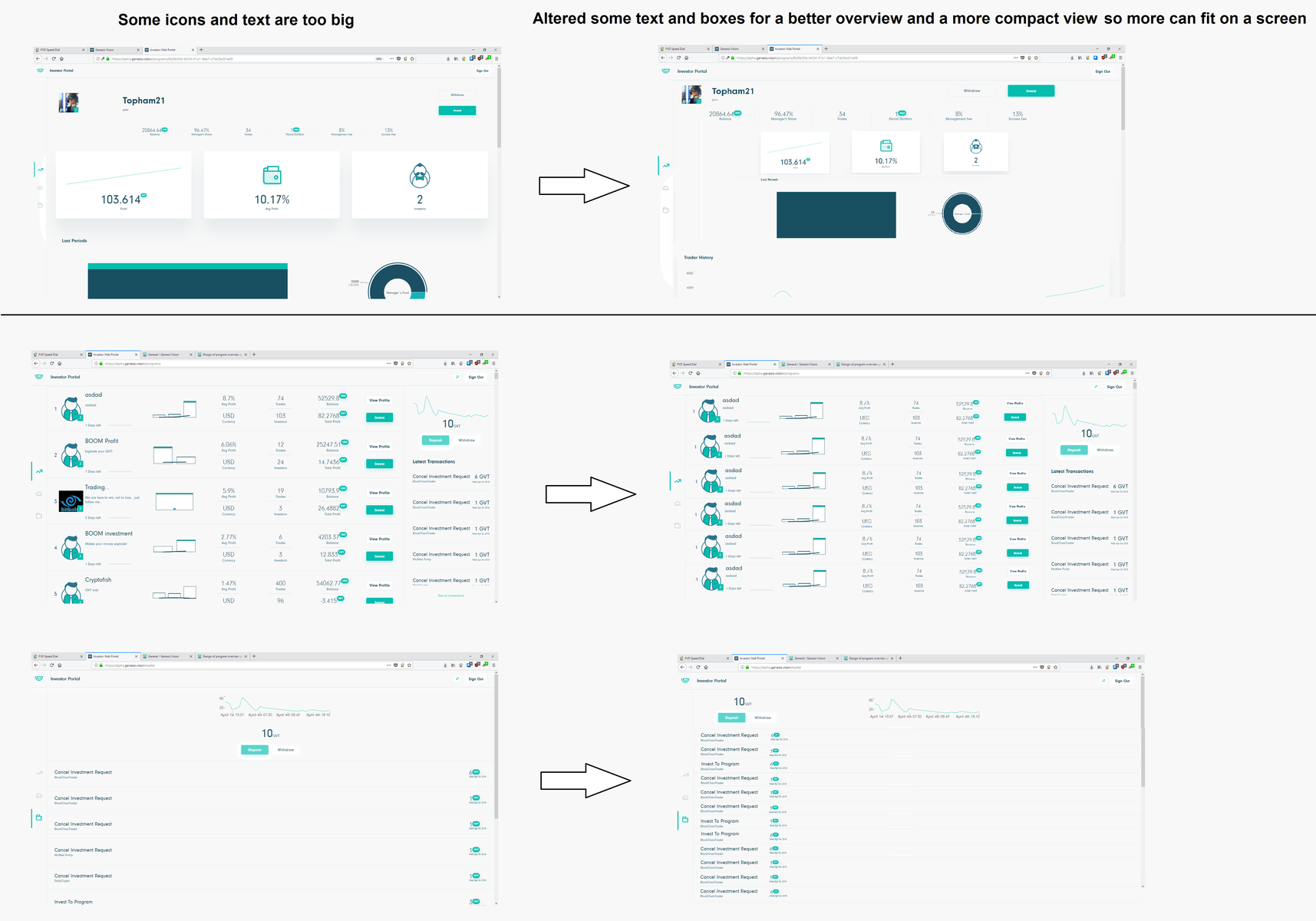
Overview improvements ! text/icon/spacing size in the app and web version are too big.
Personally, i need to zoom out my webpage to 60% to be able too se a better, compact look of the portal. Would like to see some changes to the general size of the app for a better overview. It looks very big and feels little confusing upon first look. Make some changes to the spacing and sizing so more content can fit on a screen, because it look like its designed for a blind person, no need to have so big boxes and spacing between them.
Something like this would be way better :
https://feedback.genesis.vision/communities/1/topics/98-design-of-program-overview-page-mobile
+ I have tried to alter it down so it wont look that big :
something like this is way better imho, i have removed, resized some spacing and its more compact now.
Customer support service by UserEcho

Hello and thank you for the constuctive critisism!
The Alpha version of the platform is not representative of the final version of the product, so we are listening to the feedback very closely.
Your suggestion will be forwarded to the developer team.
Thank you!