- General
-
 Ideas
Ideas

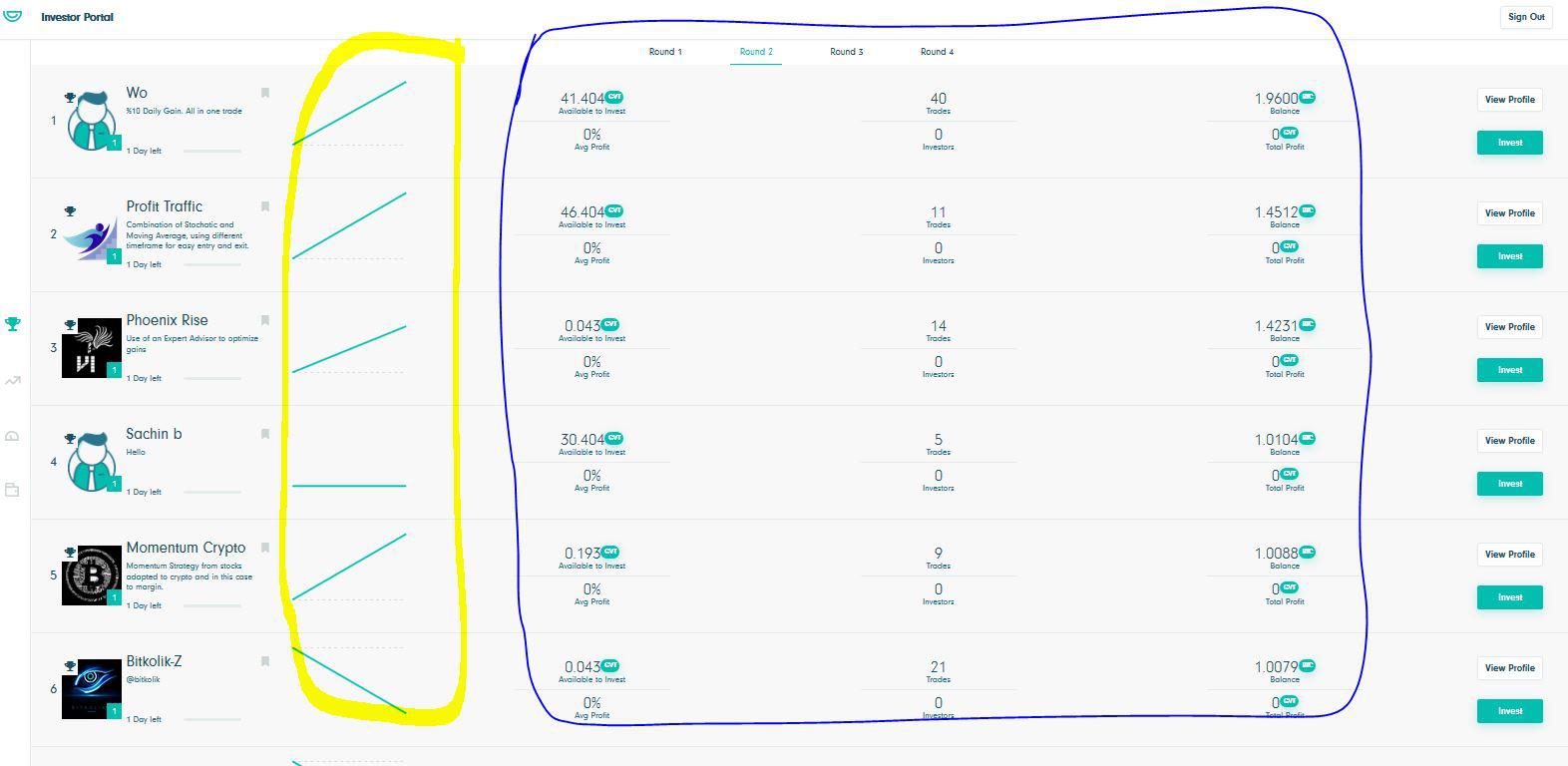
Investor Screen - Cannot understand the Logic of the Chart
Dear Dev Team: As soon as I login, I get the below Screen. As an Investor, by looking at the Charts HIGHLIGHTED in Yellow does not make any sense with the Information provided in the BLUE HIGHLIGHTED area.
In the Blue Highlighted area, there is not enough information compare which EACH CHART is going UP or STRAIGHT or DOWN.
In my opinion, anyone who see a screen MUST be able to understand what the information on the screen is presenting. So far I have noticed that the information provided on the Screen is not with Clarity and the Investors have an issue understanding.
Please put effort in making the information on the Screen Self explanatory.
Sorry, If my understanding is incorrect, please explain me.
Luv you guys. Please keep up your hard work.
Customer support service by UserEcho

Thanks for your feedback! In the future, we will try to make a guide for user behaviour. As for now, the area, which you lead round by yellow, shows equity. Equity is your account balance plus the floating profit/loss of your open positions:
Equity = Balance + Floating Profit/Loss. So, the graph shows the actual information of trading. As for "blue area", it shows the information which is based on the closed positions. It means that the two graphs may be not bound to each other directly. But you're right, we will think about making our interface more intuitive.
As an Investor, I want to see my performance in the CHART as a % Profit than AVG Profit.
Also, The manager Charts have to be % Profit so that Investor can VERY EASILY understand the Manager's Performance.
I hope you would consider to include % Profit Charts for both Investor and Managers.
Thank you Dev Team.