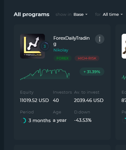
Lite card is better and easy to read
When it comes to check out all those card, the text inside could be simplified to get a better and more easy to read look.
Taking out cent's and transforming Year to Y, Months to M, Day to D.
Taking out the cent's isn't a an issue since we must click on the card to see detail's before investing.
When implemented to all card the difference is huge to the eyes and really more easy to read.
BEFORE

AFTER

Answer

Dear Client,
Thank you for this interesting idea. We appreciate you taking the time out to share your suggestions with us. I have transferred it to the team to review.
Best regards,
GV Team.

Dear Client,
We are happy to inform you that we have changed the text in the programs' cards as per your suggestion. Thank you for helping us to improve our platform. We appreciate it very much!
Best regards,
GV Team.
Customer support service by UserEcho


Dear Client,
We are happy to inform you that we have changed the text in the programs' cards as per your suggestion. Thank you for helping us to improve our platform. We appreciate it very much!
Best regards,
GV Team.