+64
Completed
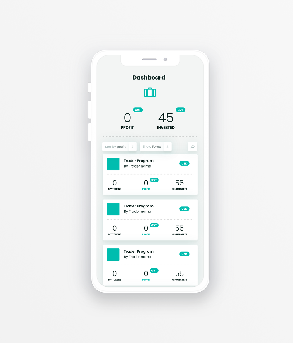
Design of program overview page (mobile)
Made a, not pixel perfect, quick mockup for the mobile version. I think it's better to create a "tiled" design for mobile to separate the traders instead of a line. I think it's easier for the eye. Not included the graph for now.
Also added a filter for instruments and an search icon for which you can use to search a program with a text input.

Customer support service by UserEcho


After did that mobile version, I also made a quick desktop sketch. (2 versions).
Wow very great ! Way more better looking that the current one. My problem with the current one is that its appear too big on a screen, some more compact view like this suggestion will be better !
I like this set up better. The current user interface is a bit clunky and is confusing a bit. I really like your design layout. Maybe the team can work on a couple design options and have the community vote?
Lovely designs!
I love your designs. Maybe it's my ageing eyes but I find it difficult to tell where one program ends and another begins
Hello and thank you for your wonderful suggestions!
We will make sure to take your designs into consideration, and our team should have contacted you already.
Thank you for your time!