You are facing a problem or an error? Visit our Knowledge Base to find a solution or to create a ticket and contact our support!

 Some general ideas for improvmenet (mostly UX)
Hi, after the recent updates, I made a quick UI/UX checkup and thought I'd throw my 2 cents with some general unrelated ideas.
1. In funds, add a pie chart with the fund allocations. This can add some colour and visuals. user friendly.
2.In program page, you have all of the content in the space place with a big scroll area. I would consider having a tab bar that helps the user navigate in that screen (Having for example "trade history" scroll down to the trade history).
This is important for orientation.
3. Filter programs by trading pairs - This can be amazing. For example I can insert 2 assets e.g. BTC and USDT, and it will only show me programs that included the pair in a trade.
4. In terms of UI, maybe add some layers to the interface. It feels a little flat. Users want to feel they swim in their private pool when browsing through the platform. The platform functionality generally feels OK, everything is smooth and nice, but I am a little concerned that the "vibe" of it is a little shady, because of the dark colours and the flat feeling. Now I am not saying it needs a big change to fix these issues, it is a matter of few tweaks, just need to think in that direction a little bit.
Thanks for reading
E.S.
Stop-loss / Take-profits on FUNDS
I’d like the stop-loss / take profits options to be added to funds. Investors could set their preferences so they would be able to get out of the funds (with profits or losses) automatically.
- This option would add both confidence to investors and safety to their investments. They would not need to constantly check the platform whether their current investment is higher/lower their expectations

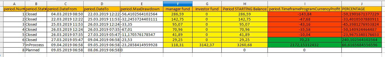
All investors needs Period History statistics of the Program.
You should add new tab under manager' program details...
"Period history..."
I think, all investors needs these statistics on the every program...
Period No ;
Period Dates
Max. Drawdown
Manager Fund
investors Fund
Period Starting Balance
Period Closing Balance
Profit.
Profit Percentage.
you can check the example...

Suspend mode for programs
On top of the 1 way communication channel (manager can make announcements to his investors) which was previously suggested, introduce a "suspend" mode. It would work the following way.
A manager wants to take a 2 week vacation away from his trading desk. He puts his program in "suspend" mode:
- all open trades need to be closed
- all withdrawal requests are immediately executed since the trades are closed.
It prevents investors from the opportunity of being in another program while his funds aren't actively traded. It also gives the opportunity to a trader to go on vacation with his investors feeling antsy.

Default view should sort based on start date of program instead of last week
Currently if a investor looks at the portal he sees program sorted by last week profit by default which shows way less profit for some program compare to their last week profit.
Also I am not aware of any filter which sort program by start date of program. All programs are of diifferent durations. I am attaching a screenshot which show top program profit as 86% whereas last week profit shows only 23%.
I believe default sorting by start date of program will attract more newbie to invest in platform

Deleveling
I would suggest adding the posibility of managers getting down graded from level 3 onwards if they consequently underperform. Like this you have a ranking system, which only allows managers to maintain their rank if they truely perform on the achieved level. This would i think greatlz benefit the investor in their ability to evaluate the abilities of a manager.

Dear Client,
We would like to inform you that the new level system was introduced during our recent platform update. Thank you very much for your suggestions regarding this matter as it really helped us to curate the new level formula. All of the information about the new level system in detail can be found in our blog - https://blog.genesis.vision/genesis-vision-update-a-level-up-d01ef51c42a
Best regards,
Genesis Vision Team
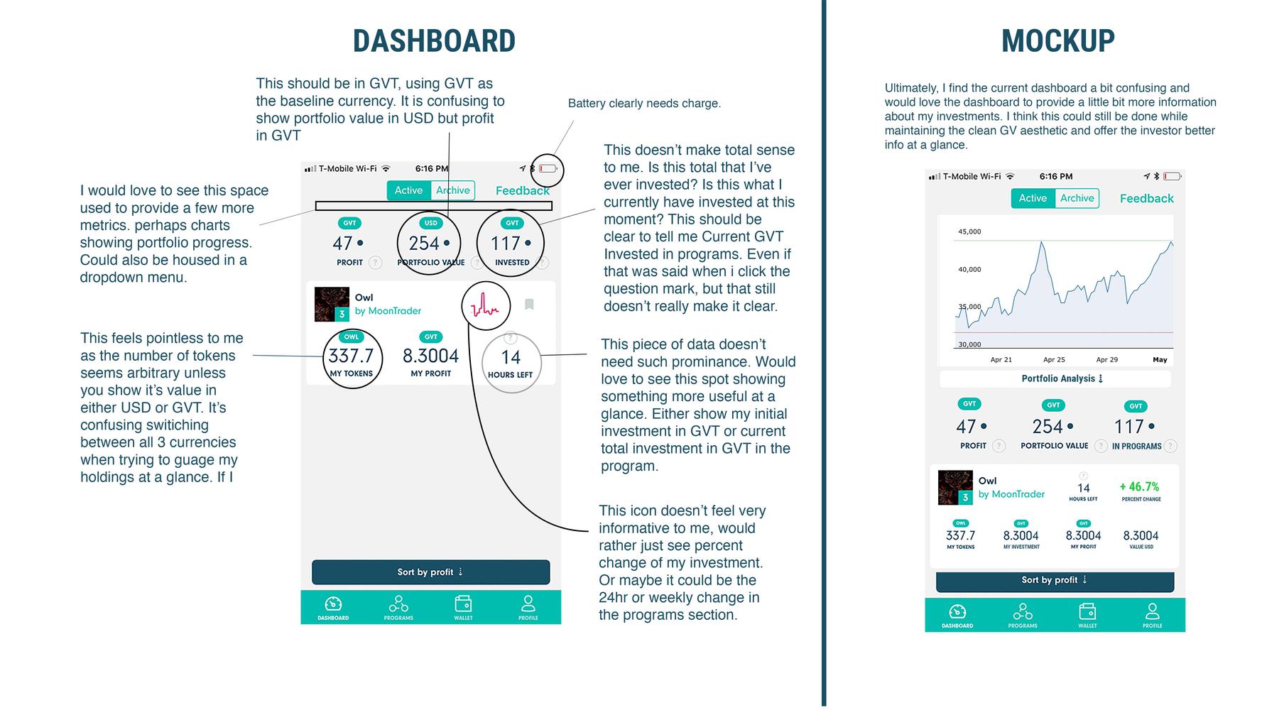
Dashboard Revisions
I put some thought into the things that bother me about the current dashboard and opted to just make a mockup. hope this is helpful...

Profit / Loss explaination
I investee 20 GVT. Got profit twice and a withdraw. So I invested 20 GVT, got 2.72 GVT profit and a withdraw of 2.656.
So that makes a total of 5,376 GVT which I’ve received after invested. What happened to the other GVT? Was that a loss?
- As you can see now I have to calculate it myself. That must be clear in a blink of an eye;
- Please make it more clear what you’ve invested in a program, what the profit and loss was;
- Instead of only a transaction list, there should be an overview of all running and completed programs you’ve invested in. When you click that program you’re seeing the stats of invested/profit/loss.
Sort by available token
programs should be able to be sorted or filtered by avaiablity of tokens in the program
Customer support service by UserEcho
